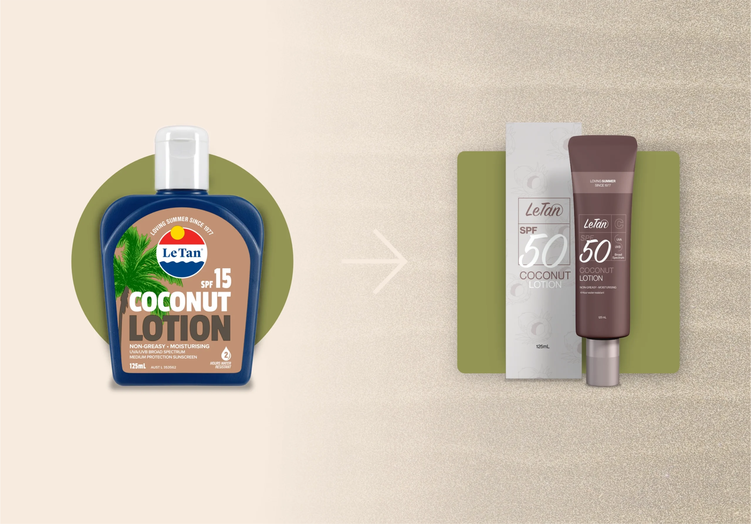
LeTan — A Playful, Modern Redesign of an Iconic Sunscreen Brand
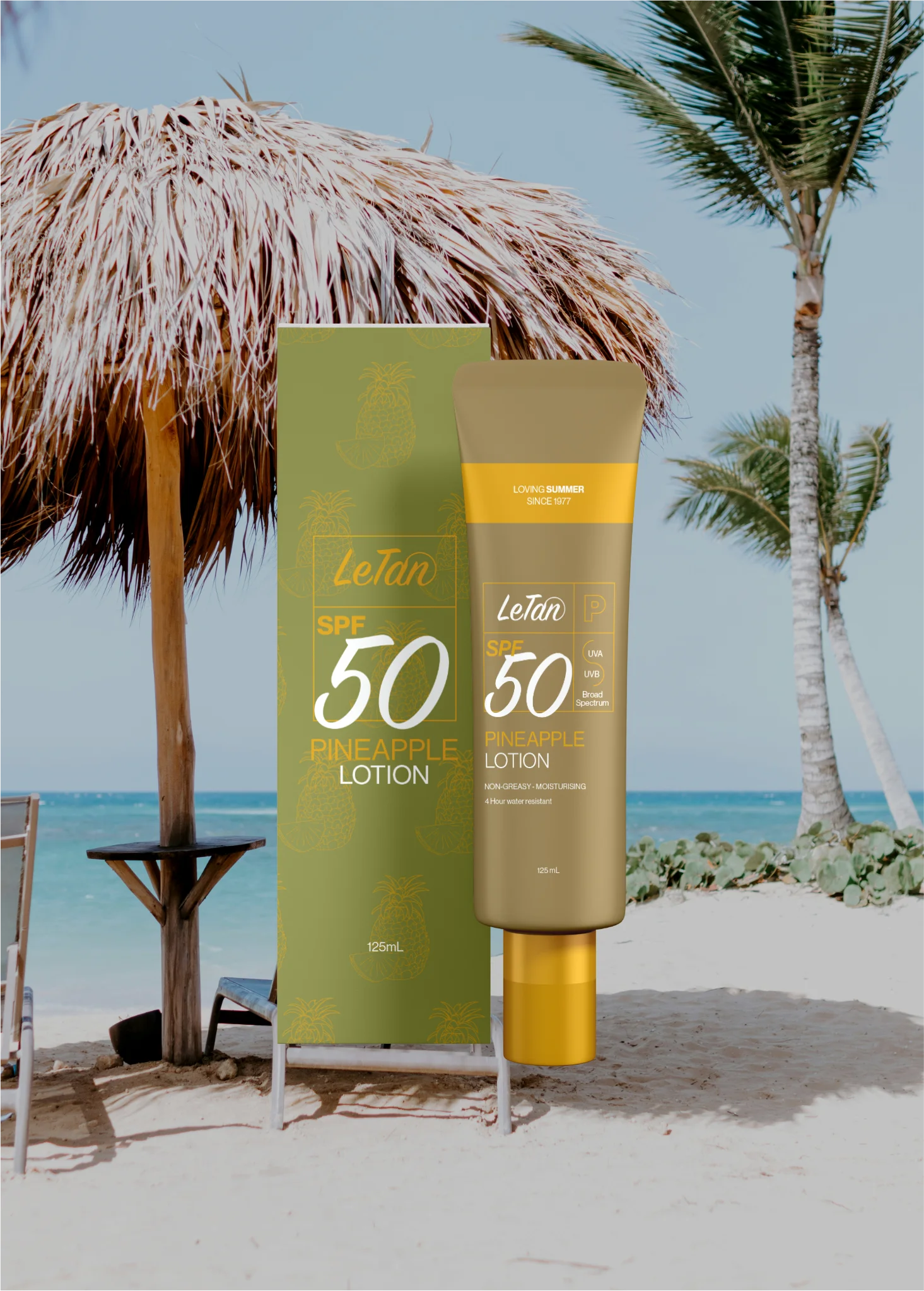
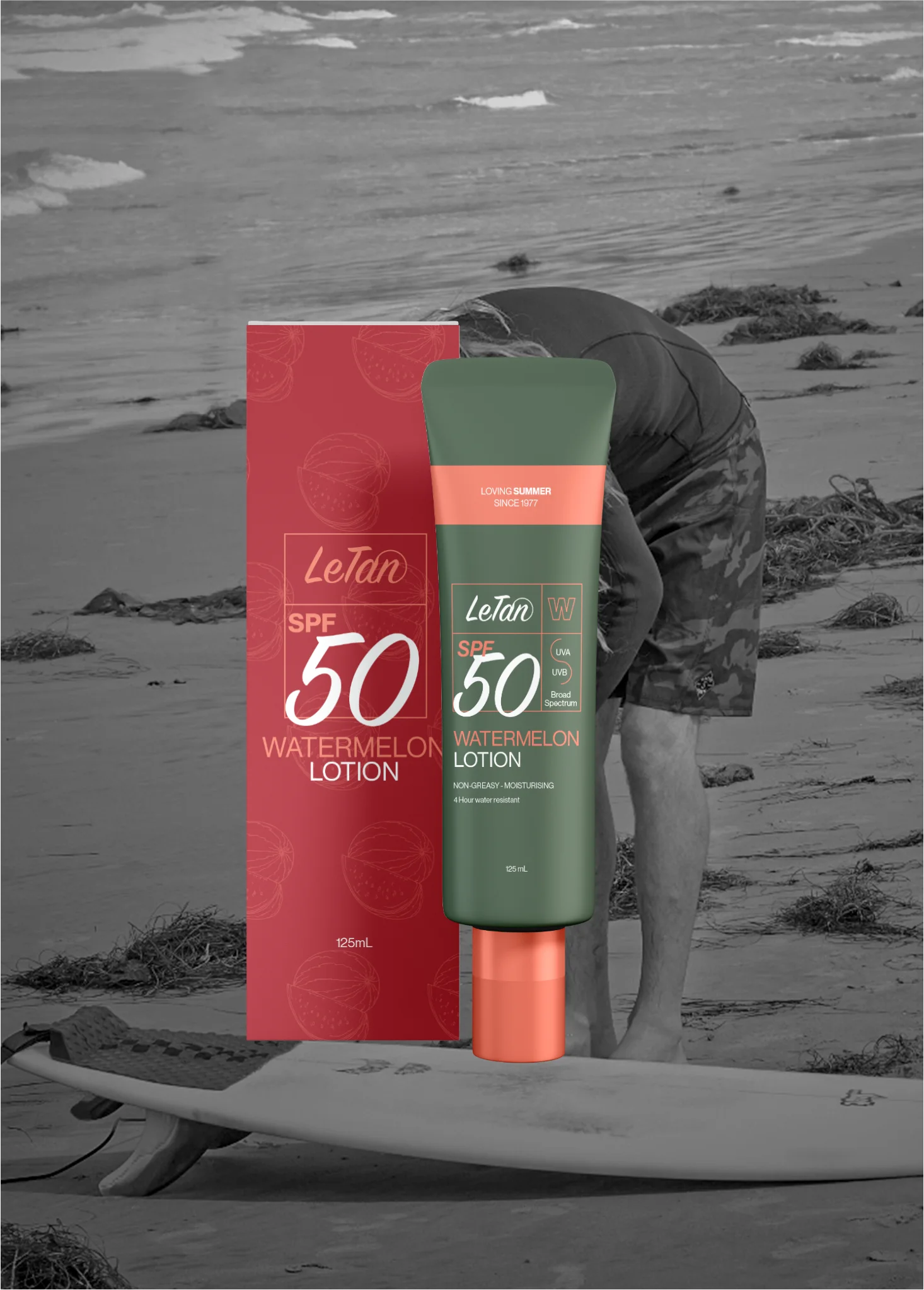
LeTan is a complete visual identity and packaging redesign for a legacy Australian sunscreen brand known for its beach-ready personality. This project reimagines LeTan through a modern, minimal lens while preserving its joyful, sun-soaked spirit. The goal was to create a brand world that feels fresh, confident, and instantly recognizable speaking to a new generation of sun lovers without alienating long time loyalists. Drawing inspiration from retro surf culture, fruit-driven scents, and contemporary editorial design, the identity balances nostalgia with clarity in a way that feels effortless and relevant.
Daniel Miranda
2024
Services
Packaging Redesign
Logo Redesign
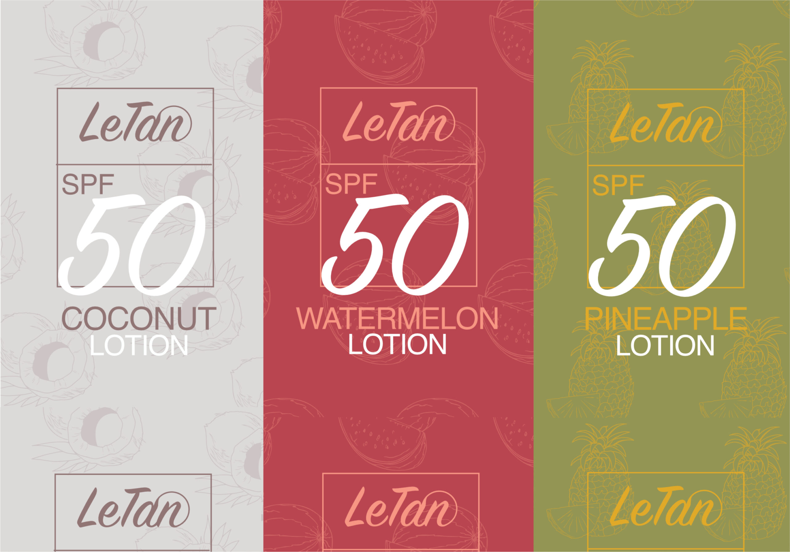
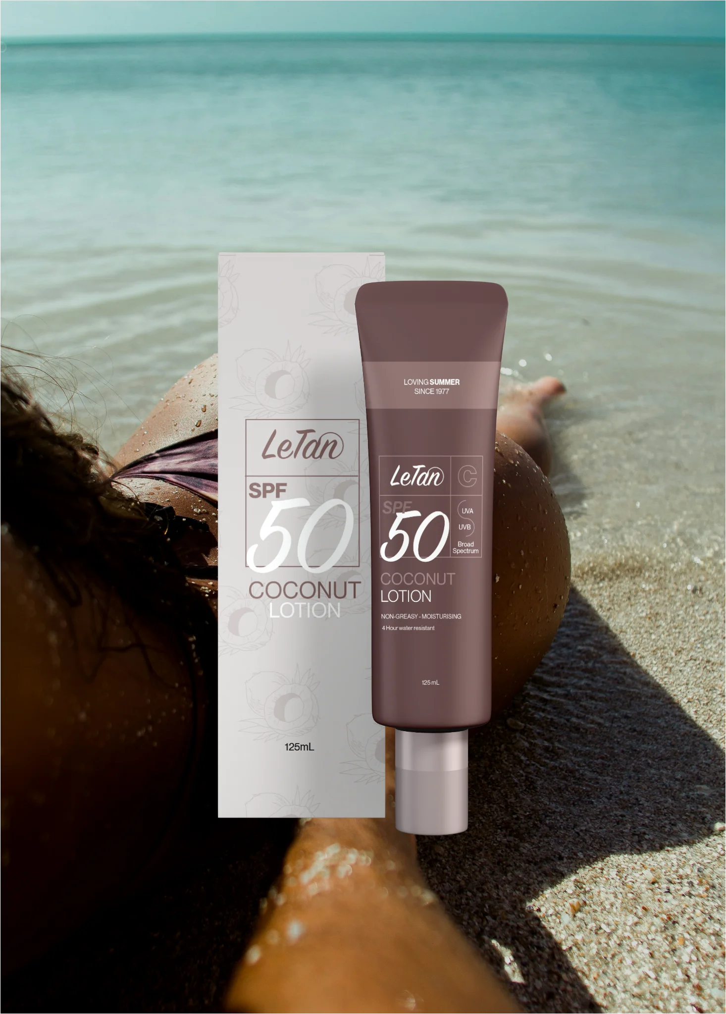
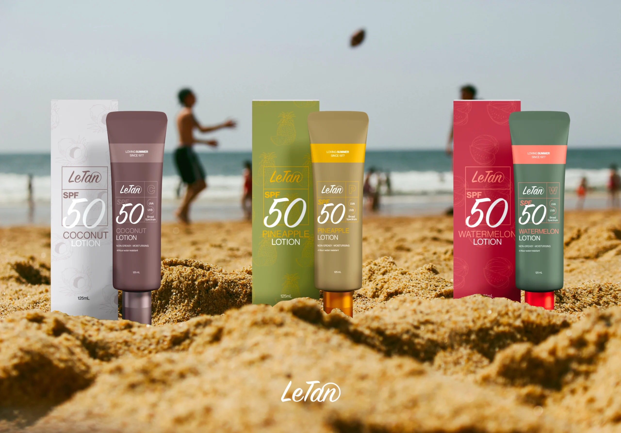
The color palette was carefully curated to evoke warmth, summer energy, and a sense of ease. Each shade reflects the brand’s connection to sun, skin, and nature, while also helping distinguish product variations across the range. Typography plays a central role in shaping the tone combining a modern, structured sans-serif for clarity with a bold, expressive typeface for SPF values and product details. This pairing creates a clean hierarchy that feels both playful and intentional, bringing confidence and cohesion to the brand across print, packaging, and digital environments.