Driving urgency with bold, retail-focused visuals.

This advertisement was designed to support FitFits’ massive clearance sale. The goal: make the discount impossible to miss while still staying true to the brand’s streetwear inspired aesthetic.

Using oversized typography, high-impact imagery, and a direct promotional message, the ad creates an immediate sense of urgency and excitement perfect for grabbing attention in-store, online, and in print placements

Translating tech into trust.

For BlueLight, a DDoS security company, the advertising needed to simplify complex services into visuals that instantly convey reliability. The campaign uses cool toned color palettes, shield iconography, and layered tech textures to speak the language of security and innovation.

Each ad frames the brand’s promise protection, prevention, and performance in a way that’s clear for businesses and banks, making technical services feel accessible and essential.


Refreshing the look, rethinking the message.

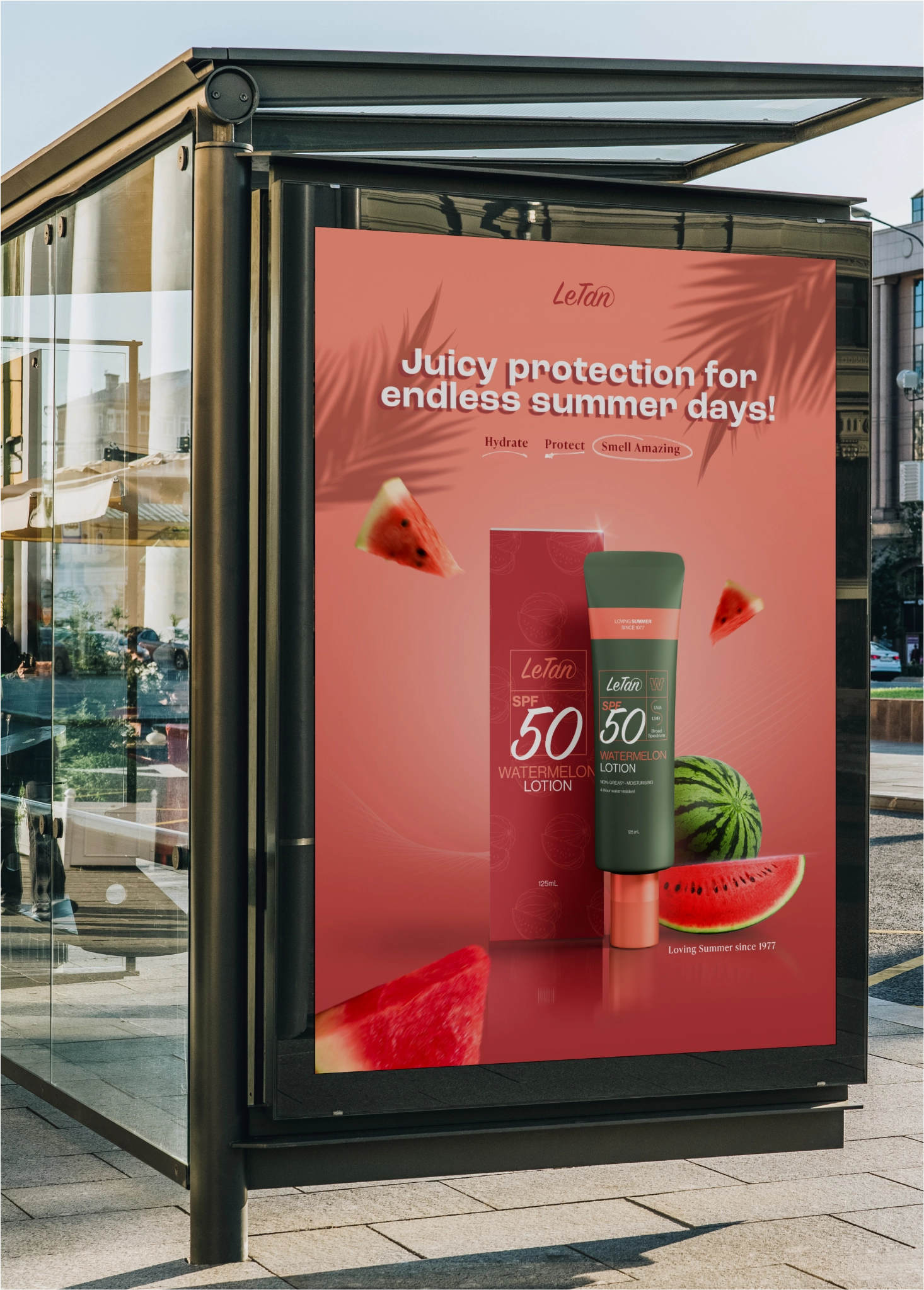
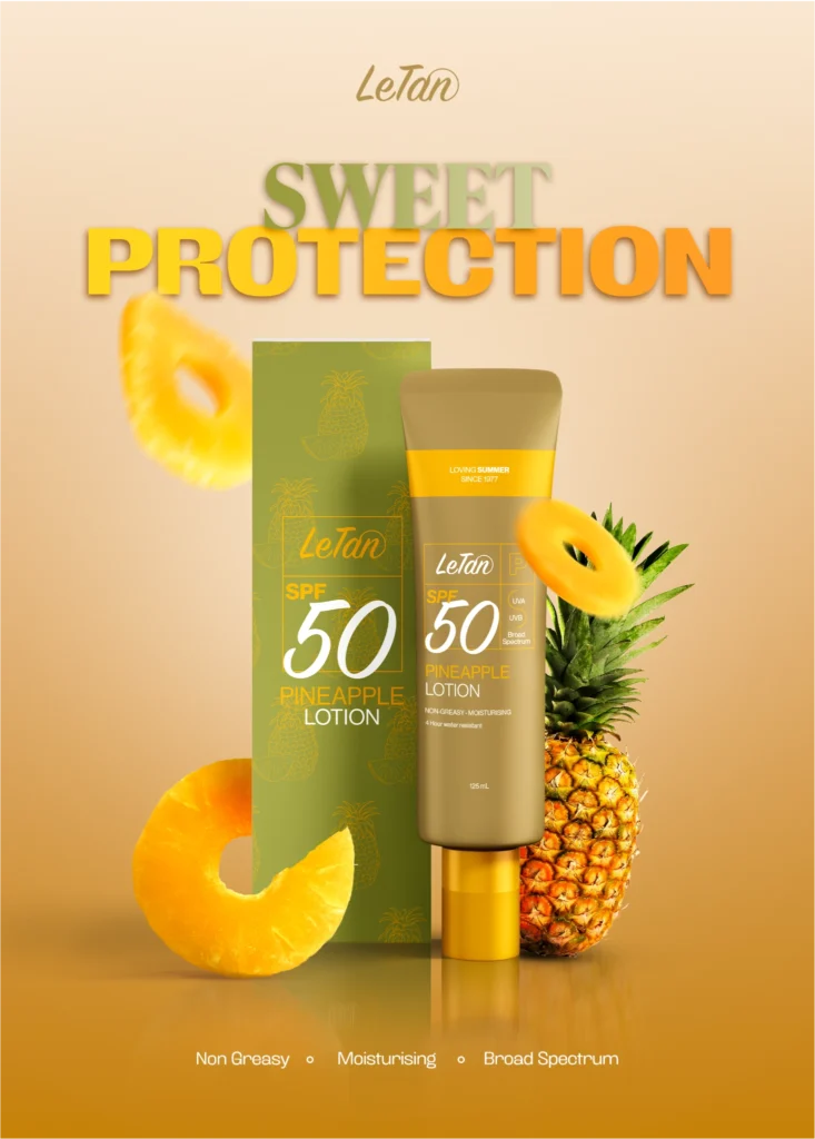
This series of ads was created as part of a rebranding exploration for LeTan, with the goal of making their SPF range feel modern, bold, and flavorful. Each piece highlights a key product variant; Watermelon, Pineapple, and Coconut and translates its core ingredient into an instantly recognizable visual hook.

By using vibrant photography, clean layouts, and punchy taglines, the ads work across digital and print formats, bringing attention to the new look while keeping the product benefits front and center.

Related Projects

ONEPEAK

FORGE

BACKSEAT

SPORTS DESIGN